Creating Bold Abstract Paintings with Shapes, Color, and Contrast
Bold abstract paintings don’t require complex layering or long sessions to feel powerful. When we focus on shapes, color, and contrast, we can create work that feels energetic, playful, and confident—often in less time than we expect. This approach invites experimentation and encourages us to trust our instincts rather than overthink each step.
Why Shapes and Contrast Matter in Abstract Painting
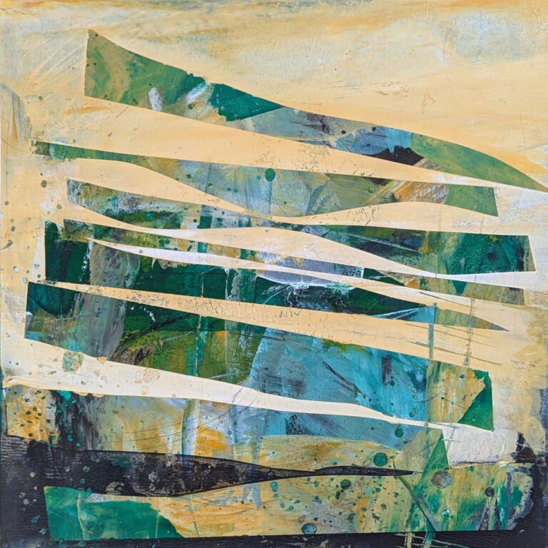
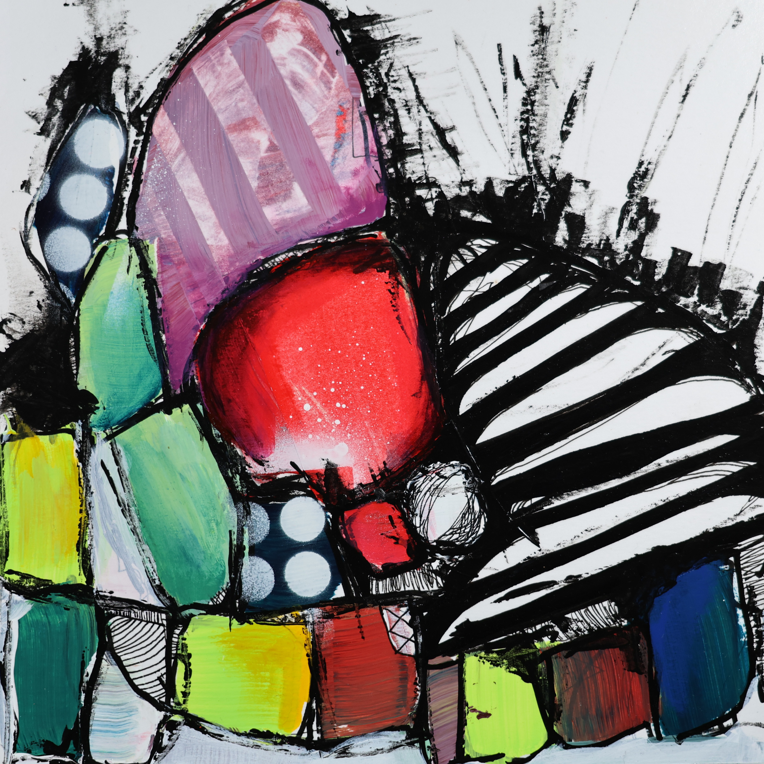
Shapes can act as the backbone of an abstract composition. Whether they’re loose, geometric, or somewhere in between, they give the painting structure and something for the eye to hold onto. Contrast brings those shapes to life. When strong forms sit next to softer areas, or bold color meets quiet space, the painting gains tension and visual energy.
Starting Loose: Letting Marks Lead the Way
Beginning with random or intuitive marks is one of the easiest ways to break the fear of a blank surface. Those early marks create momentum and unexpected shapes that we can respond to later. Instead of planning the composition from the start, we allow it to emerge through play, discovery, and reaction.
Building Energy Through Color Relationships
Working with a limited palette helps us explore color more deeply. Using some colors straight from the tube alongside softer, mixed tones creates a natural push and pull. Adding white to stronger colors creates lighter, quieter variations that balance out saturated areas. This contrast keeps the eye moving and the painting feeling alive.
Using Graphic Elements to Create Movement
Lines, repeated shapes, and bold marks introduce rhythm and direction. Diagonals can add movement, while circles or patterns create visual beats across the surface. When graphic elements interact with softer textures or fades, the painting gains depth without becoming overly complex.
Painting as a Conversation
Abstract painting is a constant back-and-forth. We make a move, step back, notice what feels heavy or quiet, and respond. When we let shapes, color, and contrast do the heavy lifting, we give ourselves permission to paint boldly, stay curious, and enjoy the process of exploration.
Frequently Asked Questions About Bold Abstract Painting
What makes an abstract painting feel bold?
Many bold abstract paintings rely on strong shapes, confident color choices, and clear contrast. Large marks, graphic elements, and intentional differences between light and dark or quiet and loud areas help create visual impact.
How do shapes influence abstract composition?
Shapes can act as anchors in an abstract painting. Whether geometric or organic, they give structure to the composition and guide the viewer’s eye through the piece.
Why is contrast important in abstract art?
Contrast creates energy and movement. This can include light versus dark, saturated versus muted color, or sharp edges next to soft transitions. Without contrast, a painting can feel flat or static.
Do abstract paintings need many layers to feel finished?
Not necessarily. While layering can add depth, bold abstract paintings can also succeed with fewer layers when shapes, color, and contrast are doing the work.
How can I stay loose and playful while painting abstractly?
Starting with random marks, limiting your palette, and responding intuitively rather than planning every move helps maintain energy and spontaneity throughout the process.